Mage's Closet
Logo Sketches
Image 1
Image 2
Image 3
Image 4
Image 5
Image 6
Image 7
Design Elements
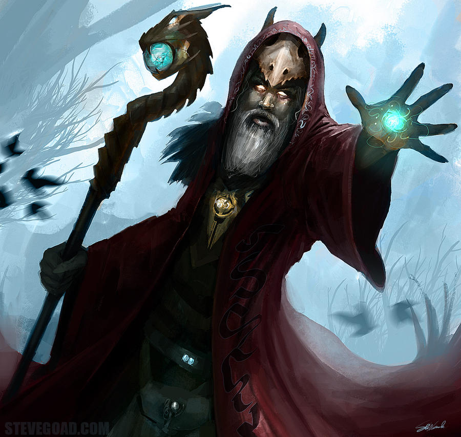
The logo that I'd finally go for (Image 7) is based on the shape of a hood. The reason why the name of the brand is Mage's Closet is because most wizard or sorcerer depicted in either movies, video games or other fiction work wears nothing but robes, occasionally hooded robes.

Design Elements Research (on the ones that didn't qualify as the Final Logo)
One of the logo (Image 2, bottom left) on the sketches' design comes from the letter M of Celtic styled letters, which I fuse it with the shape of a hood. The reason why I choose Celtic influence as part of the logo is because it represents the old world (Medieval time which most fantasy-themed fiction based on).

The other logo (Image 4, left) that I did some research on is based on Ogham lettering. Ogham is an alphabet primarily used by Old Irish during 4th to 9th Century AD.
Ogham Lettering Reference: http://www.omniglot.com/writing/ogham.htm


No comments:
Post a Comment