Thursday, March 20, 2014

Idea Generations and Development #3: Further Ideas on Storyboard

Image 1
The above storyboard tells about man trying to give a presentation but failed in doing so, due to his self-esteem.

Image 2
This storyboard tells on a situation in a public transportation. Quite similar (on the mission and vision) of the first storyboard I propose (http://iqbalartwork.blogspot.com/2014/03/ideas-generation-and-development-2.html) , but in shorter frames and different creative approach.

Both of the storyboard has the same line used at the end.
Speak Up. Act Now.

Corporate Identity #6: Logo Design

Logo Designs Compilation


Logo with Text Designs Compilation


Chosen Logo Design Black & White

Thursday, March 13, 2014

Wednesday, March 12, 2014

Corporate Identity #4 (Logo ideas)

Brand Name
Mage's Closet


Logo Sketches

Image 1

Image 2

Image 3

Image 4

Image 5

Image 6

Image 7


Design Elements
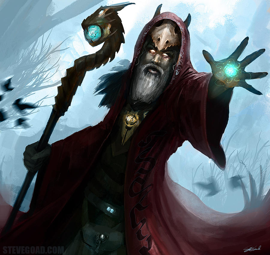
The logo that I'd finally go for (Image 7) is based on the shape of a hood. The reason why the name of the brand is Mage's Closet is because most wizard or sorcerer depicted in either movies, video games or other fiction work wears nothing but robes, occasionally hooded robes.
Image from: http://andrebdois.deviantart.com/art/Character-Art-Wizard-172130596

Design Elements Research (on the ones that didn't qualify as the Final Logo)
One of the logo (Image 2, bottom left) on the sketches' design comes from the letter M of Celtic styled letters, which I fuse it with the shape of a hood. The reason why I choose Celtic influence as part of the logo is because it represents the old world (Medieval time which most fantasy-themed fiction based on).
Celtic Alphabets Reference: http://www.stencil-library.com/celtic-lettering-stencils/page1.html

The other logo (Image 4, left) that I did some research on is based on Ogham lettering. Ogham is an alphabet primarily used by Old Irish during 4th to 9th Century AD.
Ogham Lettering Reference: http://www.omniglot.com/writing/ogham.htm

Monday, March 10, 2014

Corporate Identity #3 (Ideas and Direction)

At first, my idea is to create a campaign for mobile telecommunication company (Maxis). But after further discussing with Mr Ken, I change the direction of the campaign.

I'm thinking of creating a new brand of hoodies-only apparel line.

Why hoodies?
As a hoodie lover myself, I had a hard time wearing it in Malaysia due to its tropical climate. Most of the hoodies here were made of wool, which of course not a recommended material to be worn in hot weather.

Target Market
Teenagers and Young Adult, 15-30, Male and Female.

USP
My hoodies are made with cotton. Which is one of the best material for hot tropical weather such as Malaysia. Cotton permits movement of air from the skin through the fabric, allowing heat to dissipate and reducing humidity. It also absorbs moisture well, keeping the skin dry and increasing evaporation.
Reference used : http://www.wisegeek.org/what-are-the-best-fabrics-to-wear-in-tropical-climates.html

The Campaign
The hoodies will be designed with batik element on it, which is a part of Malay Heritage. Thus creating an awareness amongst youngsters on our now threatened art. So, by donning batik on hoodie (which is most youngsters would want to wear), they will accidentally carry on Malay heritage with them. The campaign will be launched with Jabatan Kebudayaan dan Kesenian Negara (Department of Culture and Arts).
Official Web Portal: http://www.jkkn.gov.my/
The reason I say it as Malay heritage, rather than Malaysian heritage is because Indonesia had won the rights of Batik as their heritage on 2009.
Reference: http://www.nytimes.com/2009/09/15/world/asia/15iht-batik.html?_r=0
Meanwhile, Malay, is a race of Austronesian people which is of Malaysian, Indonesian, Brunei, Burma, Singapore, and Thailand.
Reference: http://en.wikipedia.org/wiki/Ethnic_Malays

Mind Map

Art Direction for Advertising #2 (Sketches and Direction)

Direction
At first after deciding on Jacker, I thought of repackaging. As you can see in above TV commercial, the idea is emphasized on stealing the chips. One of the reason is because the name 'Jacker' refers to someone who robs you (Reference: http://www.urbandictionary.com/define.php?term=jacker).
Then, after further discussing and sketching, I've come to conclusion to create a variant line for Jacker Potato Chips. It will be themed after street gangsta/hustler/bad boy. The reason for a variant is because the theme doesn't quite sit well for kids.

Name: Jacker Jack'd (may or may not change)
Tagline: Break yo self! (ditto)

Sketches


Ideas Generation and Development #2 (Storyboard)

After a week of ideas brainstorming, I had decided to go with "Speaking up, acting out" attitude. So, it doesn't matter if it's in a public transport or anywhere.
The storyboards below are for the public transport ethics social commentary TV commercial which I previously thought of doing.